What the Refill Health dashboard is about?
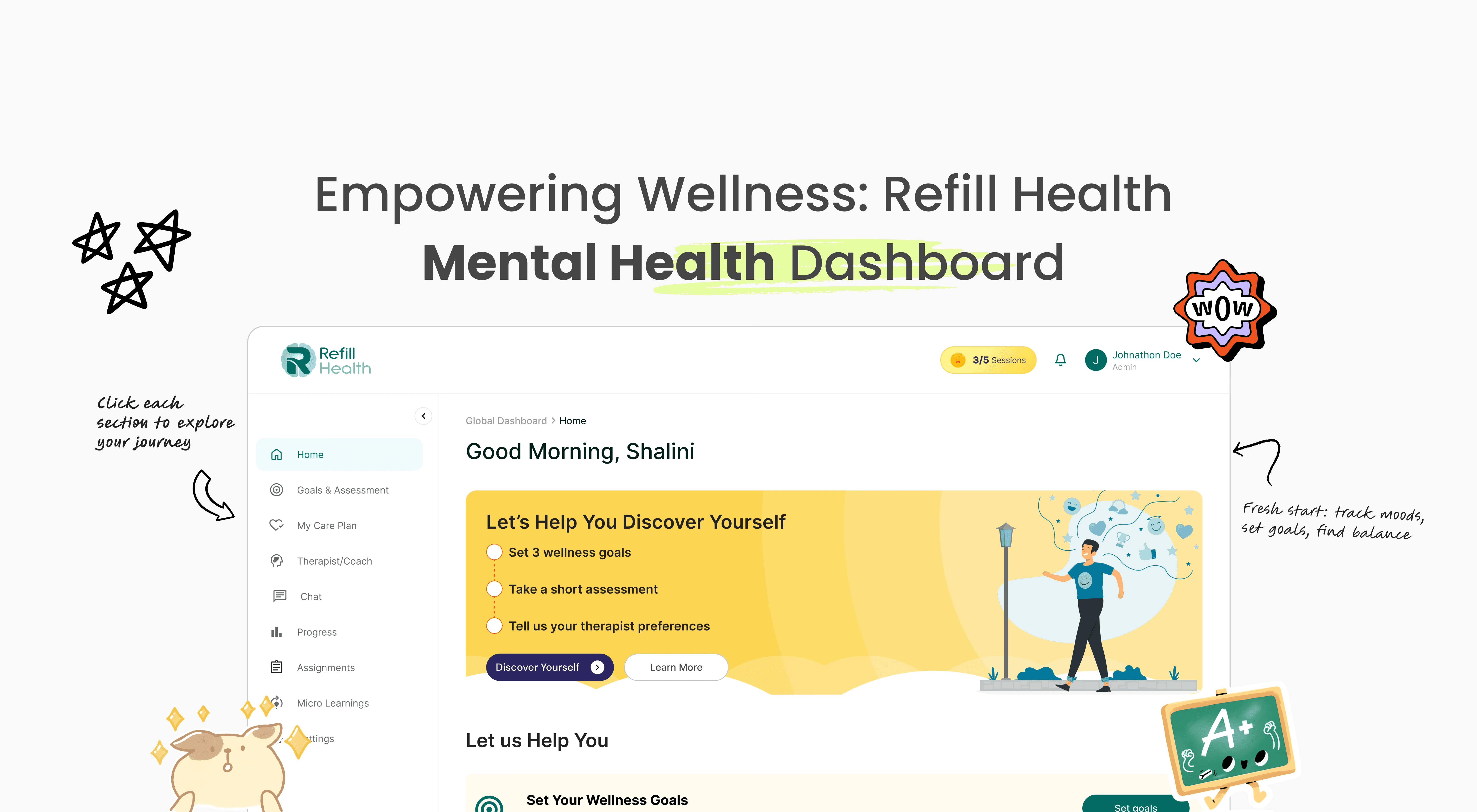
Managing health data can feel overwhelming.
The Refill Health dashboard turns scattered inputs into a calm, clear view of long-term progress.
Our target audience?
Primary users
People managing ongoing health conditions who need a clear, low-stress view of their health data and progress.
Secondary users
Doctors, therapists, or health coaches who use the dashboard to understand patient trends and make informed care decisions.
So what makes this any different?

Problems
No single view of progress
Health data was spread across screens, making it hard to understand overall progress.
Hard to know what matters
Users saw lots of information but couldn’t quickly tell what needed attention.
Too much effort to stay
Frequent check-ins felt tiring, leading to drop-offs over time.
Progress hard to explain
Users and care providers struggled to review and discuss changes clearly.
Constraints that guided decisions
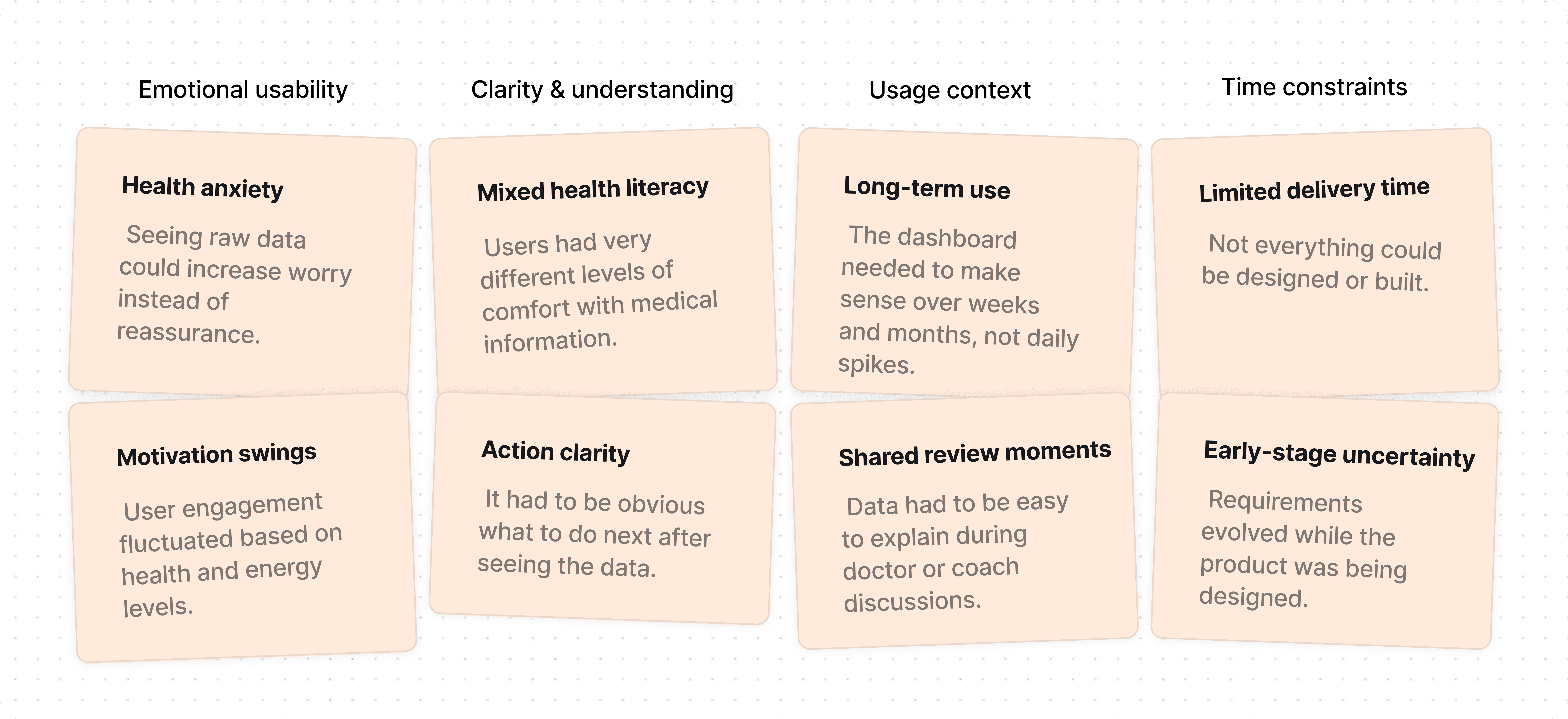
Design Tradeoffs

Fewer steps over full control – We simplified flows to reduce effort, even if it limited advanced adjustments.

Clarity over data volume – We showed less information at once so users could actually understand it.

Consistency over personalization – We kept flows predictable instead of allowing heavy customization.
Here's What I Did As A Designer:
Turned scattered health data into a single, clear progress view
Reduced cognitive load by showing only what matters, when it matters
Designed flows that support long-term, inconsistent use
Balanced clarity and consistency while working within early-stage constraints
User Personas
Poor experience
Good experience
Best practices
Less Clinical – High-Level Strategic
Operations Manager
- Struggles with measuring the effectiveness of wellness programs.
- Difficulty identifying and prioritizing key user needs.
+ Focused on reducing user churn and ensuring engagement.
Clinical Director
- Limited visibility into changing client needs.
- Dependent on multiple teams for implementation and tracking.
+ Ensures care plans are delivered and outcomes reviewed.
+ Manages platform alignment with clinical goals.
Care Leader – Operational Executive
Head of Care Delivery
- Burdened with justifying program outcomes and communicating value to nonclinical stakeholders.
- Faces challenges with disconnected tools and inconsistent progress tracking.
+ Oversees wellness and therapy engagement across cohorts.
+ Coordinates teams and systems to ensure continuity of care.
+ Needs dashboards for effective team and leadership communication.
Support Team Leads
- Often lack visibility into overall care strategy.
+ Includes care coordinators, clinical analysts, and QA teams managing adherence and outcomes.
Care Providers – Day-to-Day Practitioners
Therapist or Coach
- May struggle to track progress across clients or lack visibility into user goals.
+ Conducts assessments and sessions.
+ Tailors wellness content and recommends personalized actions.
+ Ensures clients follow care plans and stay on track.
Support Staff
- May become reactive to check-ins without full client context.
+ Deep expertise in handling emotional needs.
+ Operate on the front lines, ensuring client support and engagement.
Support. Track. Grow
Personalized Progress Cards: See your emotional trends at a glance.
One-Tap Journal Access: Easy access to daily reflections.
Quick Therapist Access: Message or book in seconds.

Therapy, Your Style
Pause & Resume: Progress auto-saves so users can continue anytime.
Sensory-Friendly: Calm colors and simple layouts reduce overload.
Therapist Matching: Choose therapists based on style & approach.

Therapy, Simplified
Smart Matching: Get therapists based on goals and preferences.
Flexible Slots: Book sessions quickly with real-time availability.
Quick Rebooking: Rebook past sessions in one step.

Design Intervention- 1
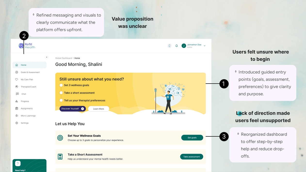
Clarified Entry Points to Reduce Drop-Off
Users felt unsure about where to begin their journey.
Lack of direction led to hesitation and drop-offs.
Added guided prompts to help users set goals, assess needs, and share preferences.
Design Intervention- 2
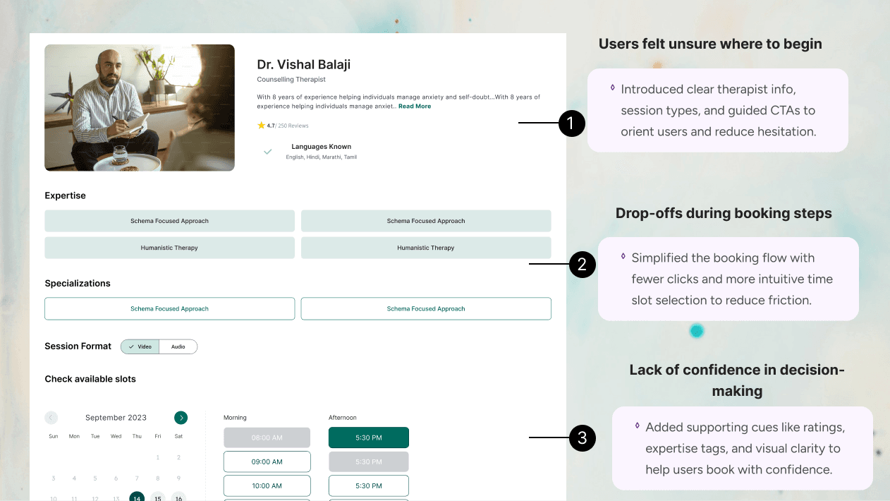
Simplified Booking Flow to Encourage Session Booking
Users felt overwhelmed by too many time slot options.
Unclear session mode (audio/video) led to confusion and hesitation.
Grouped slots, clarified mode selection, and added smart defaults to ease decision-making.
Four Principles for Better Mental Healthcare
Accessibility First, Always!
While creating the ReFil Health dashboard, we placed inclusivity at the center from day one, making sure each touchpoint feels safe, welcoming, and simple for people managing their mental health.
01
Trigger-Free Design
We avoid harsh visuals and clutter, creating calm screens that reduce anxiety and support focus.
02
Flexible Reading Modes
Distraction-free layouts, larger text, and pacing tools help users read and interact with ease.
03
Emotional Safety Cues
Gentle wording and supportive prompts guide actions without judgment or overwhelm.
My Growth As A Designer
Empathy First
I learned removing clutter creates calm, safety, and emotional trust.
Data with Heart
Designing context around numbers taught me how to reduce overwhelm.
Inclusive Mindset
Exploring neurodivergent needs improved accessibility and inclusivity in design.
Systems with Trust
Reusable components built consistency while keeping human connection central.

No need to Swipe Right
No need to Swipe Right
I think we’re a perfect match. Let's design, build and create beautiful experiences together.
Talk Design Over Chai?

A cat person

Photography

Hi, it's me :)
What the Refill Health dashboard is about?
Managing health data can feel overwhelming.
The Refill Health dashboard turns scattered inputs into a calm, clear view of long-term progress.
Our target audience?
Primary users
People managing ongoing health conditions who need a clear, low-stress view of their health data and progress.
Secondary users
Doctors, therapists, or health coaches who use the dashboard to understand patient trends and make informed care decisions.
So what makes this any different?


Problems
No single view of progress
Health data was spread across screens, making it hard to understand overall progress.
Hard to know what matters
Design dreams one thing, dev delivers another. Let’s build that missing common ground & further errors.
Too much effort to stay
Hitting UI standards feels like climbing Everest, every single time. We need smoother, reusable.
Progress hard to explain
Users and care providers struggled to review and discuss changes clearly.
Constraints that guided decisions


Design Tradeoffs


Fewer steps over full control – We simplified flows to reduce effort, even if it limited advanced adjustments.


Clarity over data volume – We showed less information at once so users could actually understand it.

Consistency over personalization – We kept flows predictable instead of allowing heavy customization.
Here's What I Did As A Designer:
Turned scattered health data into a single, clear progress view
Reduced cognitive load by showing only what matters, when it matters
Designed flows that support long-term, inconsistent use
Balanced clarity and consistency while working within early-stage constraints


User Personas
Poor experience
Good experience
Best practices
Less Clinical – High-Level Strategic
Operations Manager
- Struggles with measuring the effectiveness of wellness programs.
- Difficulty identifying and prioritizing key user needs.
+ Focused on reducing user churn and ensuring engagement.
Clinical Director
- Limited visibility into changing client needs.
- Dependent on multiple teams for implementation and tracking.
+ Ensures care plans are delivered and outcomes reviewed.
+ Manages platform alignment with clinical goals.
Care Leader – Operational Executive
Head of Care Delivery
- Burdened with justifying program outcomes and communicating value to nonclinical stakeholders.
- Faces challenges with disconnected tools and inconsistent progress tracking.
+ Oversees wellness and therapy engagement across cohorts.
+ Coordinates teams and systems to ensure continuity of care.
+ Needs dashboards for effective team and leadership communication.
Support Team Leads
- Often lack visibility into overall care strategy.
+ Includes care coordinators, clinical analysts, and QA teams managing adherence and outcomes.
Care Providers – Day-to-Day Practitioners
Therapist or Coach
- May struggle to track progress across clients or lack visibility into user goals.
+ Conducts assessments and sessions.
+ Tailors wellness content and recommends personalized actions.
+ Ensures clients follow care plans and stay on track.
Support Staff
- May become reactive to check-ins without full client context.
+ Deep expertise in handling emotional needs.
+ Operate on the front lines, ensuring client support and engagement.
Support. Track. Grow
Personalized Progress Cards: See your emotional trends at a glance.
One-Tap Journal Access: Easy access to daily reflections.
Quick Therapist Access: Message or book in seconds.


Therapy, Your Style
Pause & Resume: Progress auto-saves so users can continue anytime.
Sensory-Friendly: Calm colors and simple layouts reduce overload.
Therapist Matching: Choose therapists based on style & approach.


Therapy, Simplified
Smart Matching: Get therapists based on goals and preferences.
Flexible Slots: Book sessions quickly with real-time availability.
Quick Rebooking: Rebook past sessions in one step.


Design Intervention- 1
Clarified Entry Points to Reduce Drop-Off
Users felt unsure about where to begin their journey.
Lack of direction led to hesitation and drop-offs.
Added guided prompts to help users set goals, assess needs, and share preferences.
Design Intervention- 2
Simplified Booking Flow to Encourage Session Booking
Users felt overwhelmed by too many time slot options.
Unclear session mode (audio/video) led to confusion and hesitation.
Grouped slots, clarified mode selection, and added smart defaults to ease decision-making.
Four Principles for Better Mental Healthcare
Accessibility First, Always!
While creating the ReFil Health dashboard, we placed inclusivity at the center from day one, making sure each touchpoint feels safe, welcoming, and simple for people managing their mental health.
01
Trigger-Free Design
We avoid harsh visuals and clutter, creating calm screens that reduce anxiety and support focus.
02
Flexible Reading Modes
Distraction-free layouts, larger text, and pacing tools help users read and interact with ease.
03
Emotional Safety Cues
Gentle wording and supportive prompts guide actions without judgment or overwhelm.
My Growth As A Designer
Empathy First
I learned removing clutter creates calm, safety, and emotional trust.
Data with Heart
Designing context around numbers taught me how to reduce overwhelm.
Inclusive Mindset
Exploring neurodivergent needs improved accessibility and inclusivity in design.
Systems with Trust
Reusable components built consistency while keeping human connection central.
What the Refill Health dashboard is about?
Managing health data can feel overwhelming.
Refill Health turns complex health data into a clear view of progress, built for long-term care, not daily checklists.
Our target audience?
Primary users
People managing ongoing health conditions.
Secondary users
Doctors, therapists, and health coaches reviewing progress and trends.
So what makes this any different?
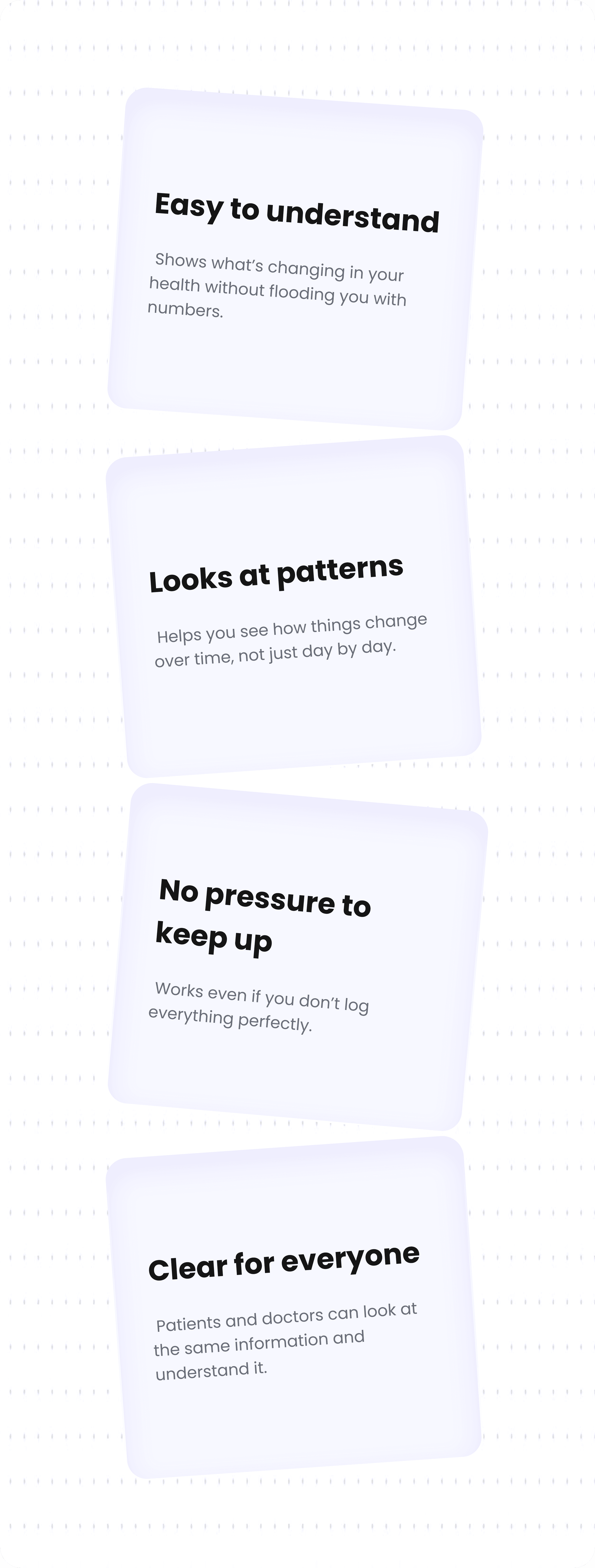

Problems
No single view of progress
Health data was spread across screens, making it hard to understand overall progress.
Hard to know what matters
Design dreams one thing, dev delivers another. Let’s build that missing common ground & further errors.
Too much effort to stay
Hitting UI standards feels like climbing Everest, every single time. We need smoother, reusable.
Progress hard to explain
Users and care providers struggled to review and discuss changes clearly.
Constraints that guided decisions
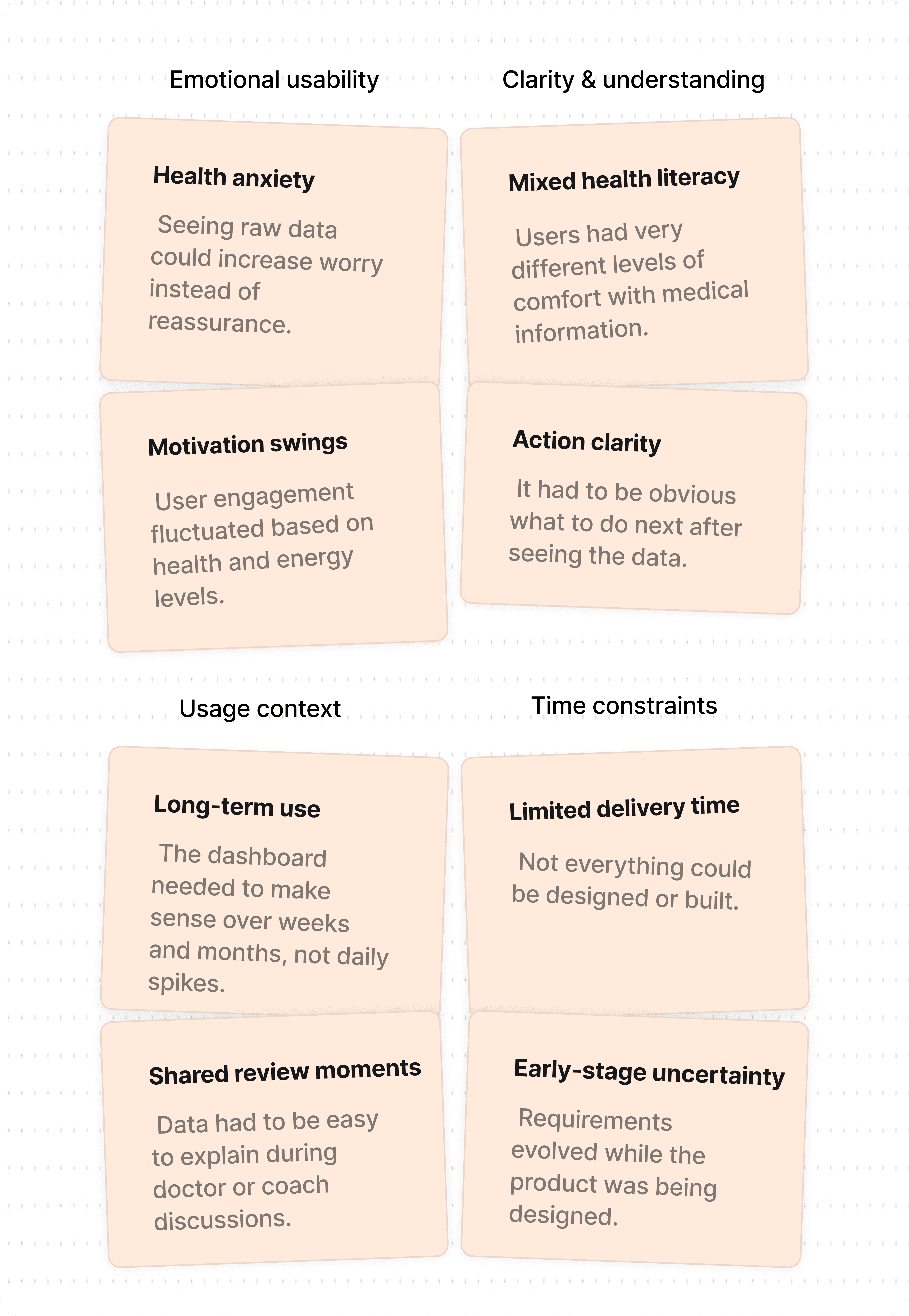

Design Tradeoffs


Fewer steps over full control – We simplified flows to reduce effort, even if it limited advanced adjustments.


Clarity over data volume – We showed less information at once so users could actually understand it.

Consistency over personalization – We kept flows predictable instead of allowing heavy customization.
Here's What I Did As A Designer:
Unified scattered data into one clear progress view
Reduced overload by showing only what matters
Designed for long-term, inconsistent use
Balanced clarity within early-stage constraints


Support. Track. Grow
Personalized Progress Cards: See your emotional trends at a glance.
One-Tap Journal Access: Easy access to daily reflections.
Quick Therapist Access: Message or book in seconds.


Therapy, Your Style
Pause & Resume: Progress auto-saves so users can continue anytime.
Sensory-Friendly: Calm colors and simple layouts reduce overload.
Therapist Matching: Choose therapists based on style & approach.


Therapy, Simplified
Smart Matching: Get therapists based on goals and preferences.
Flexible Slots: Book sessions quickly with real-time availability.
Quick Rebooking: Rebook past sessions in one step.


Design Intervention- 1
Clarified Entry Points to Reduce Drop-Off
Users felt unsure about where to begin their journey.
Lack of direction led to hesitation and drop-offs.
Added guided prompts to help users set goals, assess needs, and share preferences.
Design Intervention- 2
Simplified Booking Flow to Encourage Session Booking
Users felt overwhelmed by too many time slot options.
Unclear session mode (audio/video) led to confusion and hesitation.
Grouped slots, clarified mode selection, and added smart defaults to ease decision-making.

