

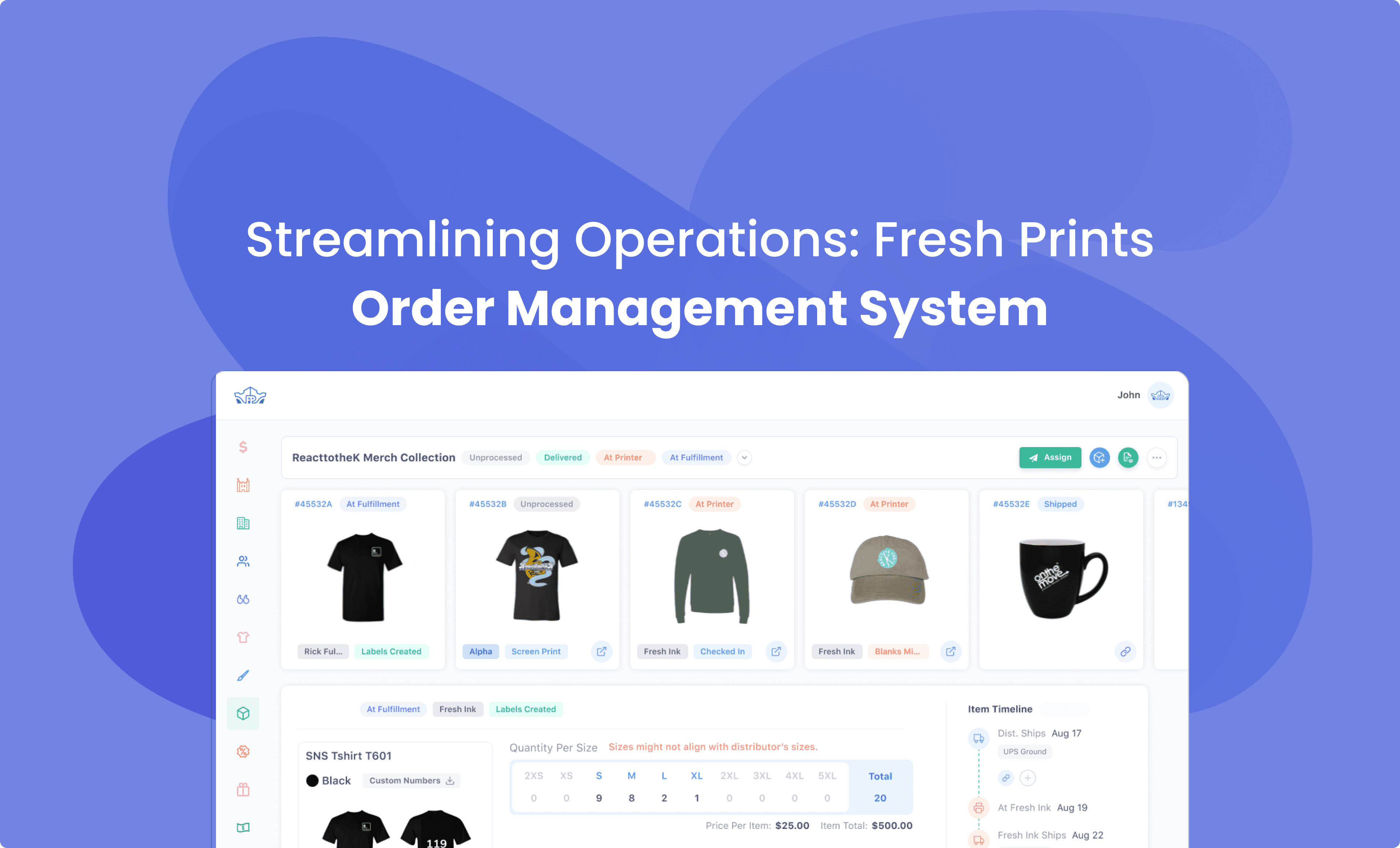
Project Overview
Built a scalable, token-based design system to unify web and internal tools.
Enabled faster iteration and adaptability across teams with consistent design foundations.
Reduced UI inconsistencies and improved developer handoff for smoother collaboration
My Growth
Power of Restraint
Every addition demanded a subtraction. The hardest part was saying no so the system could breathe.
Time as a Material
A system saves time, but building it taught me, time itself is a hidden design element, and it makes it easier.
Figma to Code
learned the toughest part wasn’t designing tokens, but mapping them into reusable, trustworthy code.
Versioning is Design Too
I learned a design system needs versioning, without branches and changelogs.
Problems
Lack of Consistency in the Ecosystem
Eliminate inconsistency between experiences across all FP's touchpoints.
Lack of Middle Ground B/W Des & Dev
Address the lack of a common repository to be used by design and dev.
Minimise the Execution Effort
Meeting the UI standards while execution is so difficult each and every time.
Focus on Business Logic
Main focus on business logic and performance over coding the components
We Made it Easier for the Devs to Access the Design System

Teams can now synchronize design tokens in minutes rather than hours

Single source of truth eliminates token drift between design and code.

Role-based access enables safe contribution from all team members
Domain and It's Design Guidelines
Design system and it's touch points
Native
Win. & Mac
Native
Android & IOS
FP's
Ecosystem
Outlook
Add-in


Swift & material UI
The mobile app uses swift for ios and material UI for android.

Kaizen Design System
To align with the ecosystem of FP and not to stand alone as a different thing it's using our library.
Why Did We Choose Our Own Design System?
kaizen Design System
Product consistency across FPt's ecosystem
Modern design and easy to incorporate
DS
We built a token-based design system to keep Fresh Prints' UI consistent, fast to build, and easy to scale across teams and tools.
Components

An Overview of kaizen design system

Button component overview

atomic Style design system
Accessbility in Design System
By baking accessibility into the very foundation, every product or feature built from the system automatically supports a wider range of users, including those with visual, cognitive, or motor challenges.
01
Color Contrast
Define text–background pairs with 7:1+ contrast and rigorously test all states, including disabled, to consistently...
02
Large clickable areas
Build buttons, icons, and toggles to be comfortably usable by users with limited dexterity, not just visually appealing.
03
ARIA labels and semantic...
Document and embed ARIA roles, landmarks, and label recommendations for each component.
If you liked that, you’ll probably love these too!


No need to Swipe Right
I think we’re a perfect match. Let's design, build and create beautiful experiences together.
Talk Design Over Chai?

A cat person

Photography

Hi, it's me :)
Project Overview
Built a scalable, token-based design system to unify web and internal tools.
Enabled faster iteration and adaptability across teams with consistent design foundations.
Reduced UI inconsistencies and improved developer handoff for smoother collaboration
My Growth
Power of Restraint
Every addition demanded a subtraction. The hardest part was saying no so the system could breathe.
Time as a Material
A system saves time, but building it taught me, time itself is a hidden design element, and it makes it easier.
Figma to Code
learned the toughest part wasn’t designing tokens, but mapping them into reusable, trustworthy code.
Versioning is Design Too
I learned a design system needs versioning, without branches and changelogs.
Problems
Lack of Consistency in the Ecosystem
Eliminate inconsistency between experiences across all FP's touchpoints.
Lack of Middle Ground B/W Des & Dev
Address the lack of a common repository to be used by design and dev.
Minimise the Execution Effort
Meeting the UI standards while execution is so difficult each and every time.
Focus on Business Logic
Main focus on business logic and performance over coding the components
We Made it Easier for the Devs to Access the Design System
Teams can now synchronize design tokens in minutes rather than hours
Single source of truth eliminates token drift between design and code.
Role-based access enables safe contribution from all team members
Domain and It's Design Guidelines
Design system and it's touch points
Native
Win. & Mac
Native
Android & IOS
FP's
Ecosystem
Outlook
Add-in
Swift & material UI
The mobile app uses swift for ios and material UI for android.

Angular material
Since FP's HQ is a web based application it's using Angular material
Kaizen Design System
To align with the ecosystem of FP and not to stand alone as a different thing it's using our library.
Why Did We Choose Our Own Design System?
kaizen Design System
Product consistency across FPt's ecosystem
Modern design and easy to incorporate
DS
We built a token-based design system to keep Fresh Prints' UI consistent, fast to build, and easy to scale across teams and tools.
Components
An Overview of kaizen design system
Button component overview
atomic Style design system
Accessbility in Design System
By baking accessibility into the very foundation, every product or feature built from the system automatically supports a wider range of users, including those with visual, cognitive, or motor challenges.
01
Color Contrast
Define text–background pairs with 7:1+ contrast and rigorously test all states, including disabled, to consistently...
02
Large clickable areas
Build buttons, icons, and toggles to be comfortably usable by users with limited dexterity, not just visually appealing.
03
ARIA labels and semantic...
Document and embed ARIA roles, landmarks, and label recommendations for each component.
If you liked that, you’ll probably love these too!
No need to Swipe Right
I think we’re a perfect match. Let's design, build and create beautiful experiences together.
Talk Design Over Chai?
A cat person
Photography
Hi, it's me :)
Project Overview
Built a scalable, token-based design system to unify web and internal tools.
Enabled faster iteration and adaptability across teams with consistent design foundations.
Reduced UI inconsistencies and improved developer handoff for smoother collaboration
My Growth
Power of Restraint
Every addition demanded a subtraction. The hardest part was saying no so the system could breathe.
Time as a Material
A system saves time, but building it taught me, time itself is a hidden design element, and it makes it easier.
Figma to Code
learned the toughest part wasn’t designing tokens, but mapping them into reusable, trustworthy code.
Versioning is Design Too
I learned a design system needs versioning, without branches and changelogs.
Problems
Lack of Consistency in the Ecosystem
Eliminate inconsistency between experiences across all FP's touchpoints.
Lack of Middle Ground B/W Des & Dev
Address the lack of a common repository to be used by design and dev.
Minimise the Execution Effort
Meeting the UI standards while execution is so difficult each and every time.
Focus on Business Logic
Main focus on business logic and performance over coding the components
We Made it Easier for the Devs to Access the Design System
Teams can now synchronize design tokens in minutes rather than hours
Single source of truth eliminates token drift between design and code.
Role-based access enables safe contribution from all team members
Domain and It's Design Guidelines
Design system and it's touch points
Native
Win. & Mac
Native
Android & IOS
FP's
Ecosystem
Outlook
Add-in
Swift & material UI
The mobile app uses swift for ios and material UI for android.
Kaizen Design System
To align with the ecosystem of FP and not to stand alone as a different thing it's using our library.
Components
An Overview of kaizen design system
Button component overview
atomic Style design system
Accessbility in Design System
By baking accessibility into the very foundation, every product or feature built from the system automatically supports a wider range of users, including those with visual, cognitive, or motor challenges.
01
Color Contrast
Define text–background pairs with 7:1+ contrast and rigorously test all states, including disabled, to consistently...
02
Large clickable areas
Build buttons, icons, and toggles to be comfortably usable by users with limited dexterity, not just visually appealing.
03
ARIA labels and semantic...
Document and embed ARIA roles, landmarks, and label recommendations for each component.
If you liked that, you’ll probably love these too!
No need to Swipe Right
I think we’re a perfect match. Let's design, build and create beautiful experiences together.
Talk Design Over Chai?
A cat person
Photography
Hi, it's me :)