What's Aha app is all about?

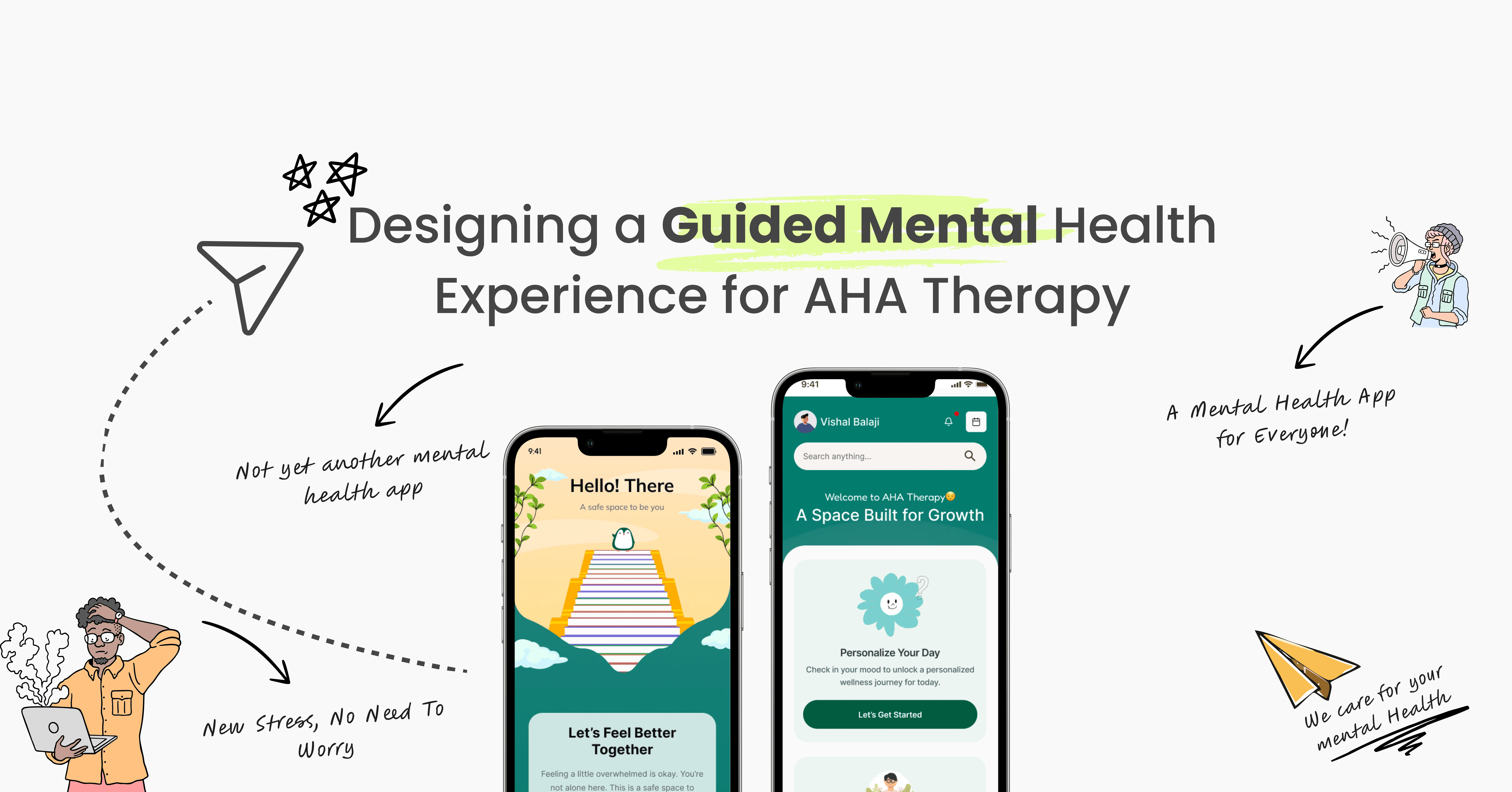
Therapy doesn’t end after a session.

Aha helps people stay connected to progress between sessions, when reflection is hardest.

Our target audience?

Primary users
People in therapy reflecting between sessions.

Secondary users
People using the app for self-reflection and awareness.

So what makes this any different?

Problems

Lack of visibility into progress

Lack of a clear, shared view of patient progress forced therapists to depend on memory and scattered notes.

Emotional friction in early

Lack of early engagement indicators meant disengagement appeared only after sessions were already missed.

Imprecise emotion

Lack of timely emotional capture reduced accuracy and depth in patient reflections.

Lack of focus on therapy

Lack of streamlined workflows pushed therapists toward admin work instead of patient care.

Constraints that guided decisions

Design Tradeoffs

Guidance over freedom — We reduced choices so users feel supported instead of overwhelmed during vulnerable moments.

Calm over speed — Designed calm, forgiving interactions to support anxious and neurodivergent users, sacrificing some speed for clarity.

Clarity over features — We removed extra tools to keep the experience calm, focused, and easily understandable.

Here's What I Did As A Designer:

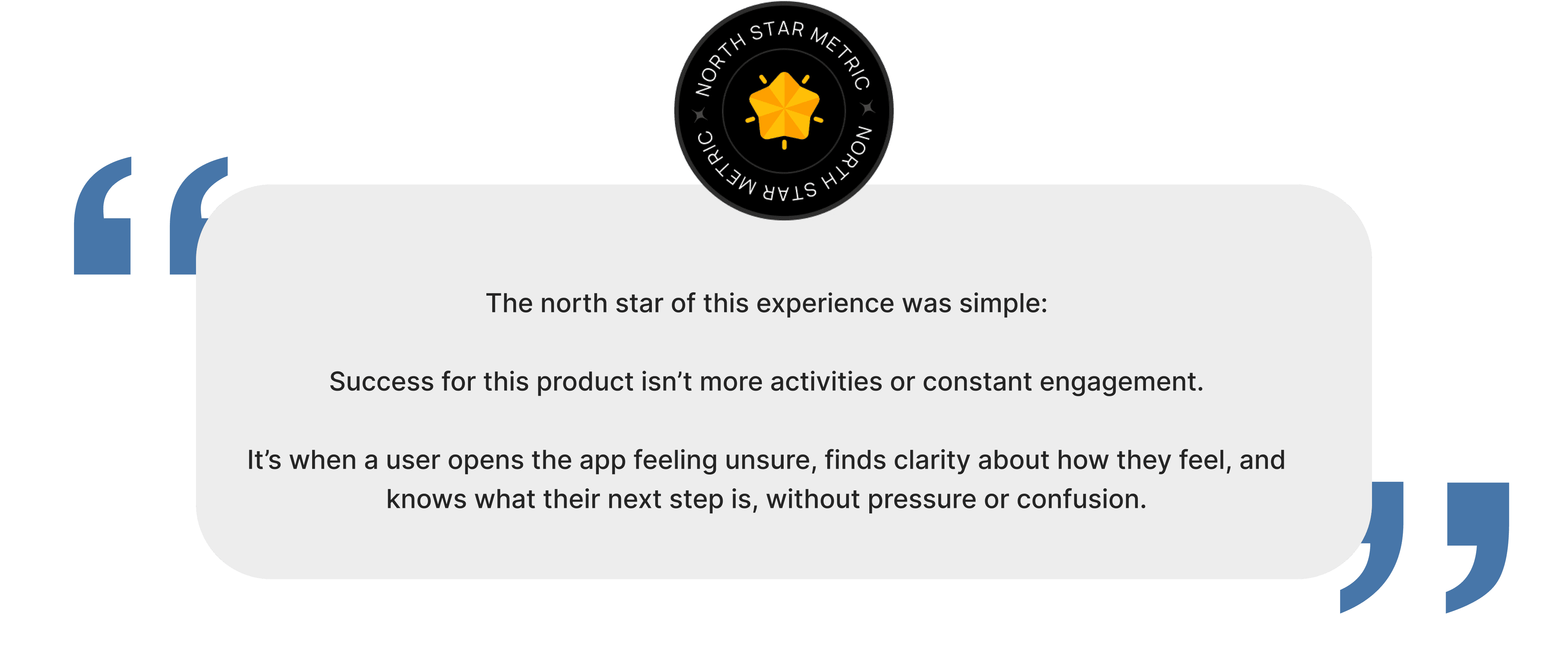
Focused the product on what breaks between sessions

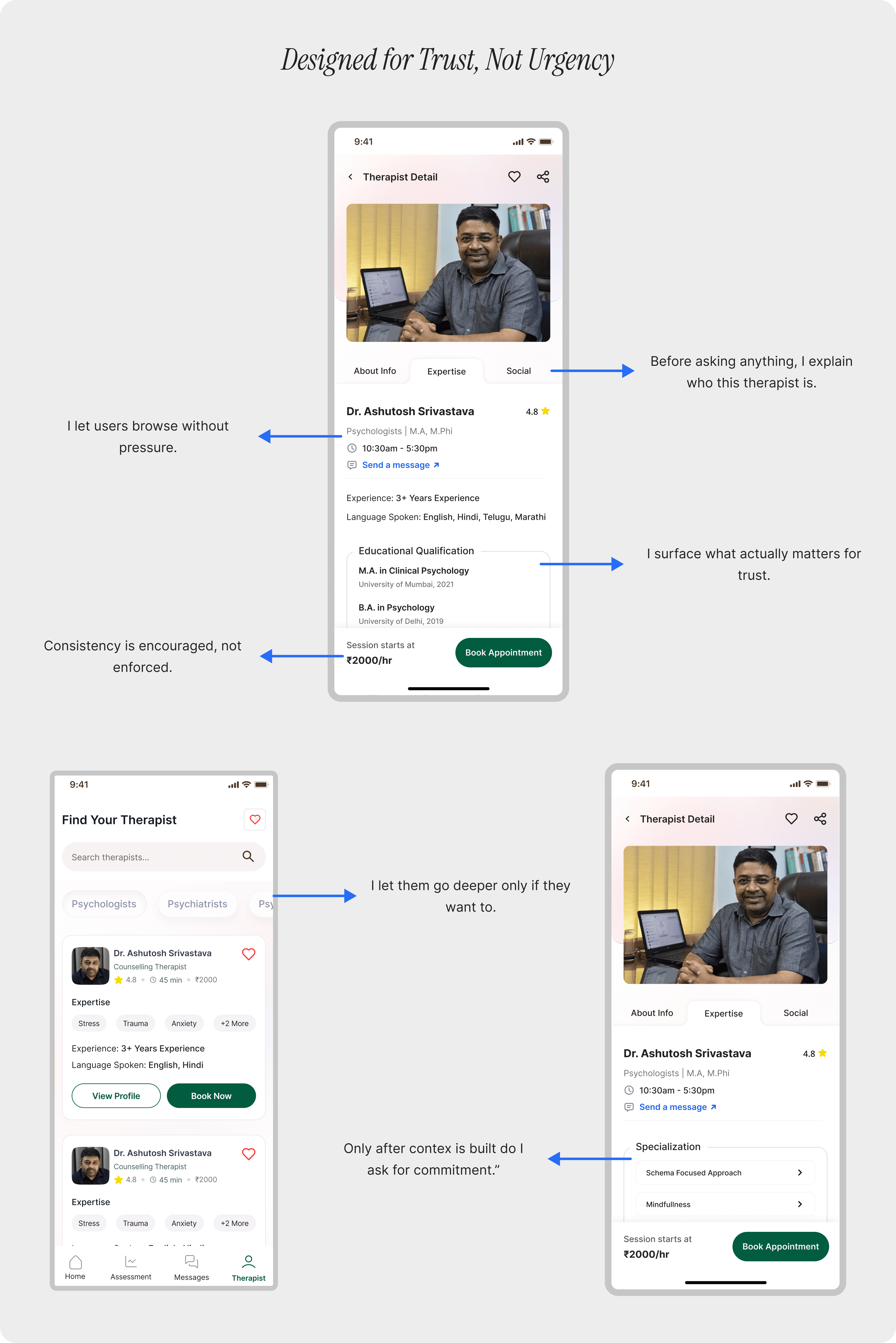
Designed for tired, anxious, inconsistent use

Cut features to keep things calm and usable

Built forgiving, low-stimulation interactions for neurodivergent users

Crafting the experience

->

Understanding the user’s state

->

If you liked that, you’ll probably love these too!

What's Aha app is all about?

Therapy doesn’t end when a session does.

Aha helps people stay connected to their progress in the days between sessions, when emotions shift and reflection is hardest.

Our target audience?

Primary users
People in therapy who do the hard work between sessions, reflecting late at night, after tough days, or when emotions spike.

Secondary users
People who aren’t in therapy but still want a quiet place to check in with themselves and build awareness over time.

So what makes this any different?

Problems

Lack of visibility into progress

Lack of a clear, shared view of patient progress forced therapists to depend on memory and scattered notes.

Emotional friction in early

Lack of early engagement indicators meant disengagement appeared only after sessions were already missed.

Imprecise emotion

Lack of timely emotional capture reduced accuracy and depth in patient reflections.

Lack of focus on therapy

Lack of streamlined workflows pushed therapists toward admin work instead of patient care.

Constraints that guided decisions

Design Tradeoffs

Guidance over freedom — We reduced choices so users feel supported instead of overwhelmed during vulnerable moments.

Calm over speed — Designed calm, forgiving interactions to support anxious and neurodivergent users, sacrificing some speed for clarity.

Clarity over features — We removed extra tools to keep the experience calm, focused, and easily understandable.

Here's What I Did As A Designer:

Reframed the product around what breaks between sessions, not during therapy

Designed flows that work when users are tired, anxious, or inconsistent

Cut features aggressively to keep the experience calm and usable

Designed interactions to be forgiving, predictable, and low-stimulation for neurodivergent users

Crafting the experience

->

Understanding the user’s state

->

Feature 1 - User Journal Entry

->

If you liked that, you’ll probably love these too!

What's Aha app is all about?

Therapy doesn’t end when a session does.

Aha helps people stay connected to their progress in the days between sessions, when emotions shift and reflection is hardest.

Our target audience?

Primary users
People in therapy who do the hard work between sessions, reflecting late at night, after tough days, or when emotions spike.

Secondary users
People who aren’t in therapy but still want a quiet place to check in with themselves and build awareness over time.

So what makes this any different?

Problems

Lack of visibility into progress

Lack of a clear, shared view of patient progress forced therapists to depend on memory and scattered notes.

Lack of signals before drop-off

Lack of early engagement indicators meant disengagement appeared only after sessions were already missed.

Lack of in-the-moment context

Lack of timely emotional capture reduced accuracy and depth in patient reflections.

Lack of focus on therapy

Lack of streamlined workflows pushed therapists toward admin work instead of patient care.

Constraints that guided decisions

Design Tradeoffs

Guidance over freedom — We reduced choices so users feel supported instead of overwhelmed during vulnerable moments.

Calm over speed — Designed calm, forgiving interactions to support anxious and neurodivergent users, sacrificing some speed for clarity.

Clarity over features — We removed extra tools to keep the experience calm, focused, and easily understandable.

Here's What I Did As A Designer:

Reframed the product around what breaks between sessions, not during therapy

Designed flows that work when users are tired, anxious, or inconsistent

Cut features aggressively to keep the experience calm and usable

Designed interactions to be forgiving, predictable, and low-stimulation for neurodivergent users

Crafting the experience

->

Understanding the user’s state

->

For First Time User

->

Feature 1 - User Journal Entry

->

My growth as a designer

Slowness as a feature

I learned that pacing, pauses, and restraint can create safety, not friction.

Designing for neurodivergence

I stopped designing for an “ideal user” and focused on clarity, forgiveness, and low cognitive load.

Tone shapes behavior

I saw how small wording and visual cues can reduce pressure or increase trust.

Guidance over features

I grew from showcasing functionality to guiding users toward meaningful actions, understanding that sequencing.

If you liked that, you’ll probably love these too!

No need to Swipe Right

No need to Swipe Right

I think we’re a perfect match. Let's design, build and create beautiful experiences together.

Talk Design Over Chai?